Portchain
About
Terminal Berth line-up software establishing effective communication between container vessel carriers and terminals
Timetable makeover
Joining a company as a new designer very often has its benefits of new fresh eyes, already during my recruitment phase I couldn't help but noticing quite some challenges in Portchains main view the timetable. The timetable perpose is keeping all parties (Carriers & Terminals) in sync with when a vessel is coming, how much load that needs to go on and off and when it leaves again. This process is of course spanned across multiple steps and days very often however the earlier delays can be tracked the more fuel or time can be saved.
Starting with the knowns
As mentioned above, I felt like there was some immediate challenges with how data with displayed especially for comparability and scanability. This was also present as user have reported
- Too much scrolling
- Didn’t notice comments
- Didn’t understand background colors (status)
- Messy overview
additionally, Portchain kept expandings its network which means the amount of data that had to be displayed would increase. The following goals was established from a Product/design
- Amount of port calls will increase 40-60% per terminals over time.
- A more ambitions table to move away from “spreadsheet” feeling.
Lastly, the following UX patterns was present
- What is important here?
- Comparative data isn’t so comparable (time stamps)
- Lack of grouping
- Lack of priority
Success criteria for project
Increase port calls in the table view
Improve efficiency by making it “Heatmap” based
Group relevant information to eliminate columns on columns
Improve comparability especially for time stamps
Incorporate more “Richness” onto the data points distancing the experience from a spreadsheet.
Improve legibility and clarity across the board.
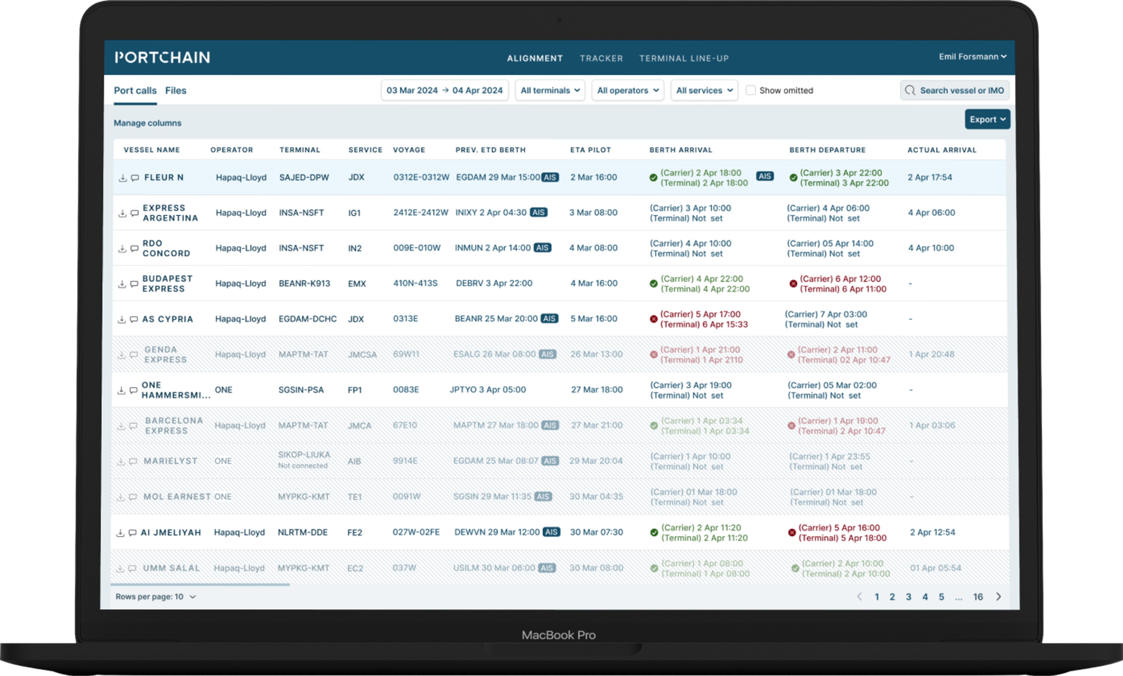
Original timetable

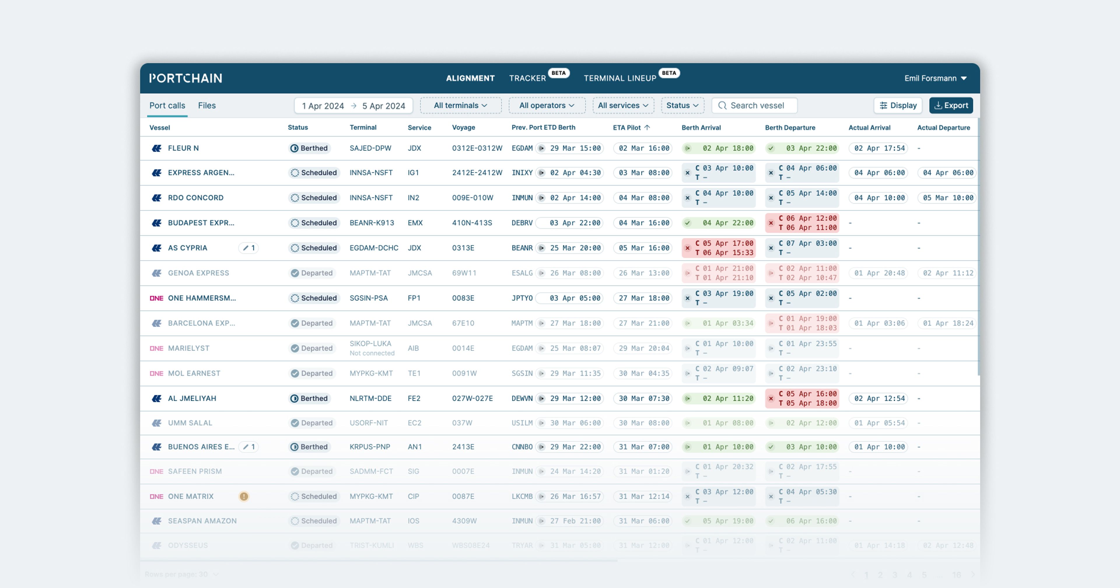
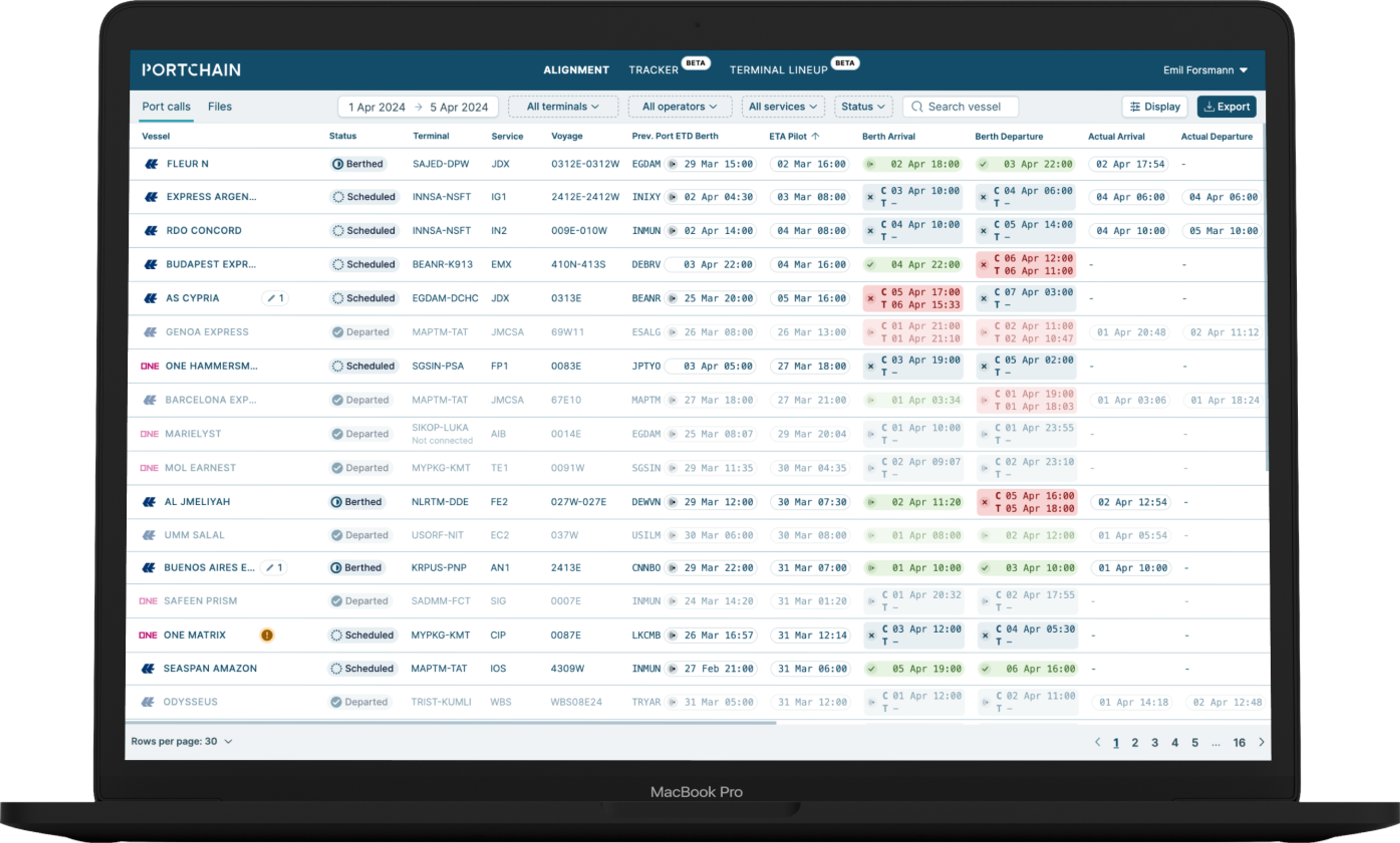
New improved timetable

- 35% more port calls above fold.
- Clear vertical and horizontal lines
- Mono font for timestamps for increase clarity.
- Carrier logos
- Dynamic “message area” for important information.
- Status is now a stamp instead of background color.
The details

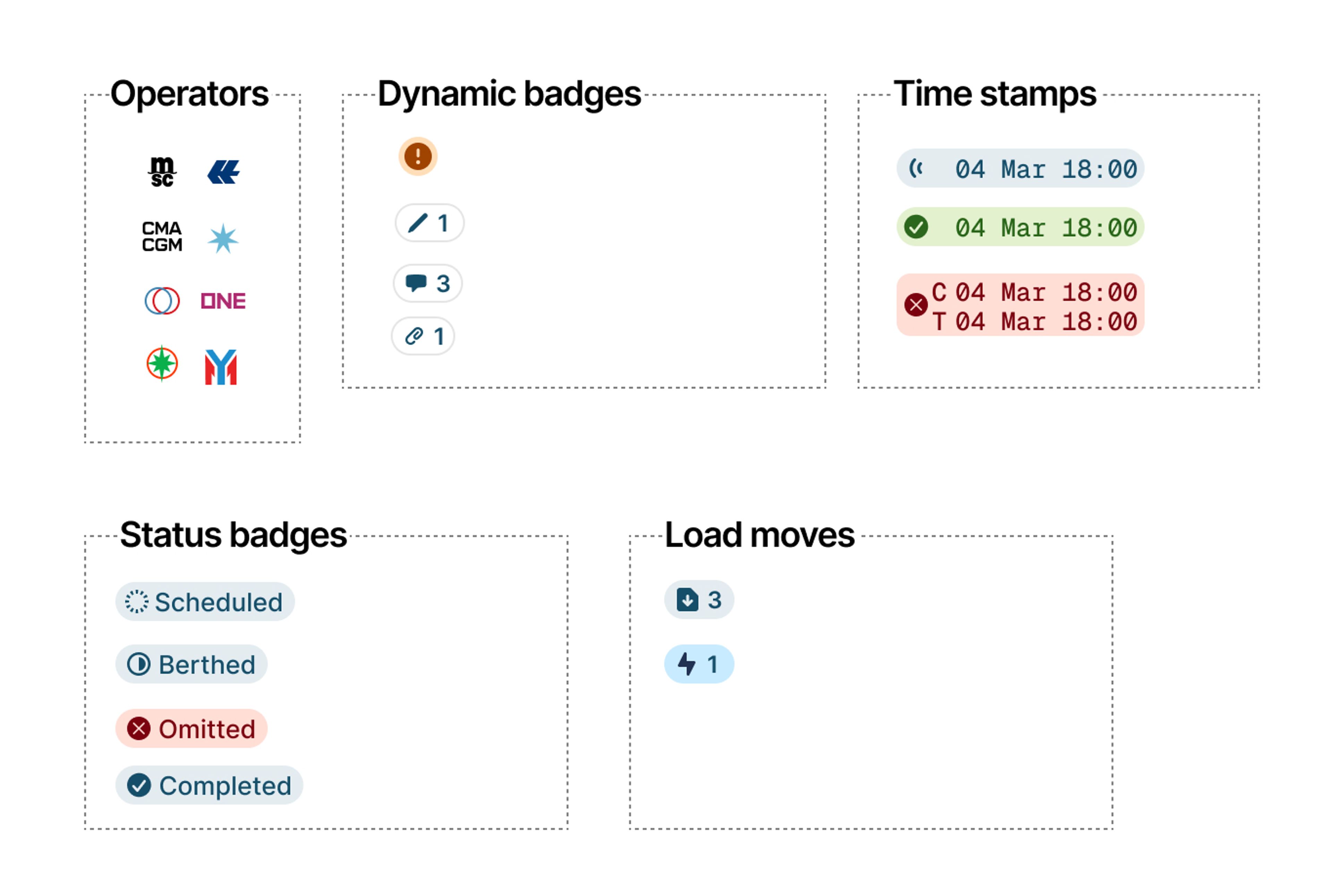
- Improved timestamps mono font for vertical comparability. Same size and 1 time stamp when alignment is made.
- Operator/Vessel Added operator logo and combined respective columns into 1, with the dynamic area.
- Dynamic area Focus on what’s important, notes, comments, files and warnings.
Introducing status Improving clarity by labeling/badging the status of the port call which previously was a background color/zebra stripes. - Moves now shown as either Imported or predicted making it visual without hover.
Roll-out and feedback
- Testing ran Thinking Aloud with 2 customers to make sure they understood each columns.
- Initial feedback was great, made minor adjustments to AIS symbol and added check/exit for timestamps due to low resolution hardware and bad eyesight (accessibility).
- Internal roll-out The whole team was introduced to the change and had it enabled on their account. Feedback was very great.
- Selected customers A pre-selected segment of customer had it enabled, customers with good relationship with and was good a providing feedback. Feedback very good as well.
- 10/25/50/100% roll-out Based feedback given we were confident to roll-out aggressively was live after 14 days for all 120 terminals/carriers. 1 months later only 1 in total was mentioned (Strike through in the 0 in the mono font 0.