Layerise
About
After-sales service for manufacturers to provide a tesla-like customer experience while capturing customer data.
Starting from a blank canvas
Any designer both dream and fear this scenario, it's not a redesign but a complete new brand, design system, UX patterns. Starting from a blank canvas can feel daunting, but so is co-founding your own company. Creating Layerise was a journey filled with new, exciting new challenges and out of existing comfort zone experiences.
A company founded on design
From the get go the company was designed (pun intended) from the ground up to be a using design techniques and processes to make the company first and foremost investment ready but also to accelerate product growth as speed is key to any startups' growth. Putting a strong brand and landing page in place helped us to get a funding early on and most of the VCs were quite surprised to learn it was only a 2-person team as the brand and landing pages were mature enough to be in a 10-20 team at least.
The Layerise design are built around 4 complimentary ideas/frameworks to make sure consistency was in place from the brand to the experience.
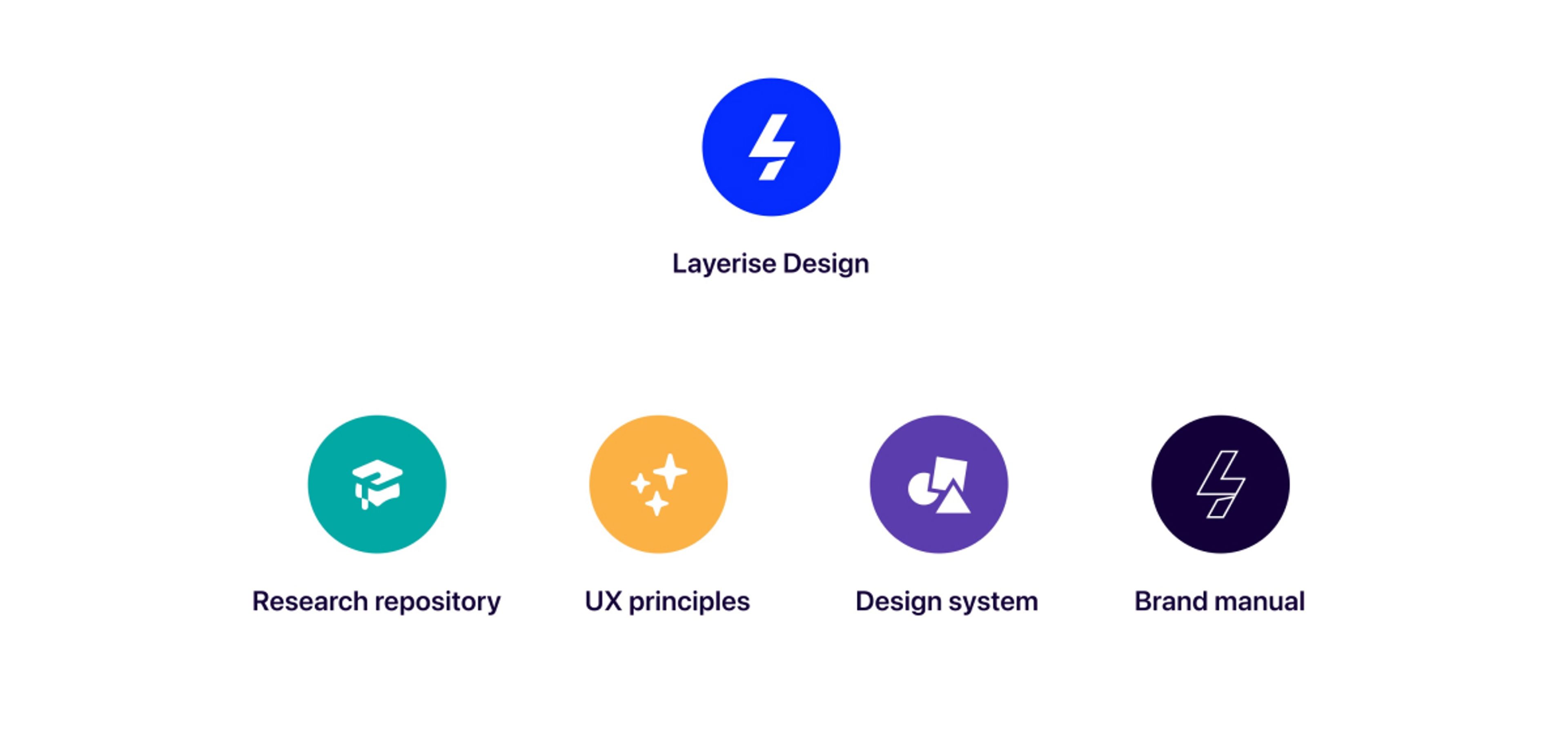
Layerise design overview
The Layerise design team created and operated with 4 different key areas to make sure the experiences is felt consistently and well established in all places from internal to external services, communication and experiences.
Introduction to the brand
Creating a brand from scratch can be a daunting process, we set up some constraints to push the brand in the way we wanted it to be felt and perceived.
Layerise was providing a new aftersales experience that is Instant and Powerful, just scan the QR code, and you're already learning about how to assemble your product, hence the use of a lightning bolt to emphasize the powerfulness and instantaneousness of the experience. Furthermore, Layerise as also part of its name is raising the layer from "dumb" manuals to somewhere in-between IoT enabled and "dumb" products, hence the multidimensional and raising the layer (Layer rise). Lastly, as a design detail, I used the shadow (multidimensional) to create the letter L.
The Layerise logo
Tokens and brand feeling
Additionally, to build it all together we wanted to make sure the brand stood out as playful, being perceived as the new cool kid on the block, as something vastly differently than what the customer base was used to (manufacturers) we wanted to spark an interested immediately into the playfulness and created a brand you just want to engage with. After weeks of research I got very inspired by the Memphis group, a group of interior design that was active in the 80s and was known for their colorful and abstract interior, coming close to form over function. I knew I found something we could get inspiration from, and we started forming our design language around lots of the same thoughts, however matching the requirements for Accessibility, Digital Interfaces and good UX experience.
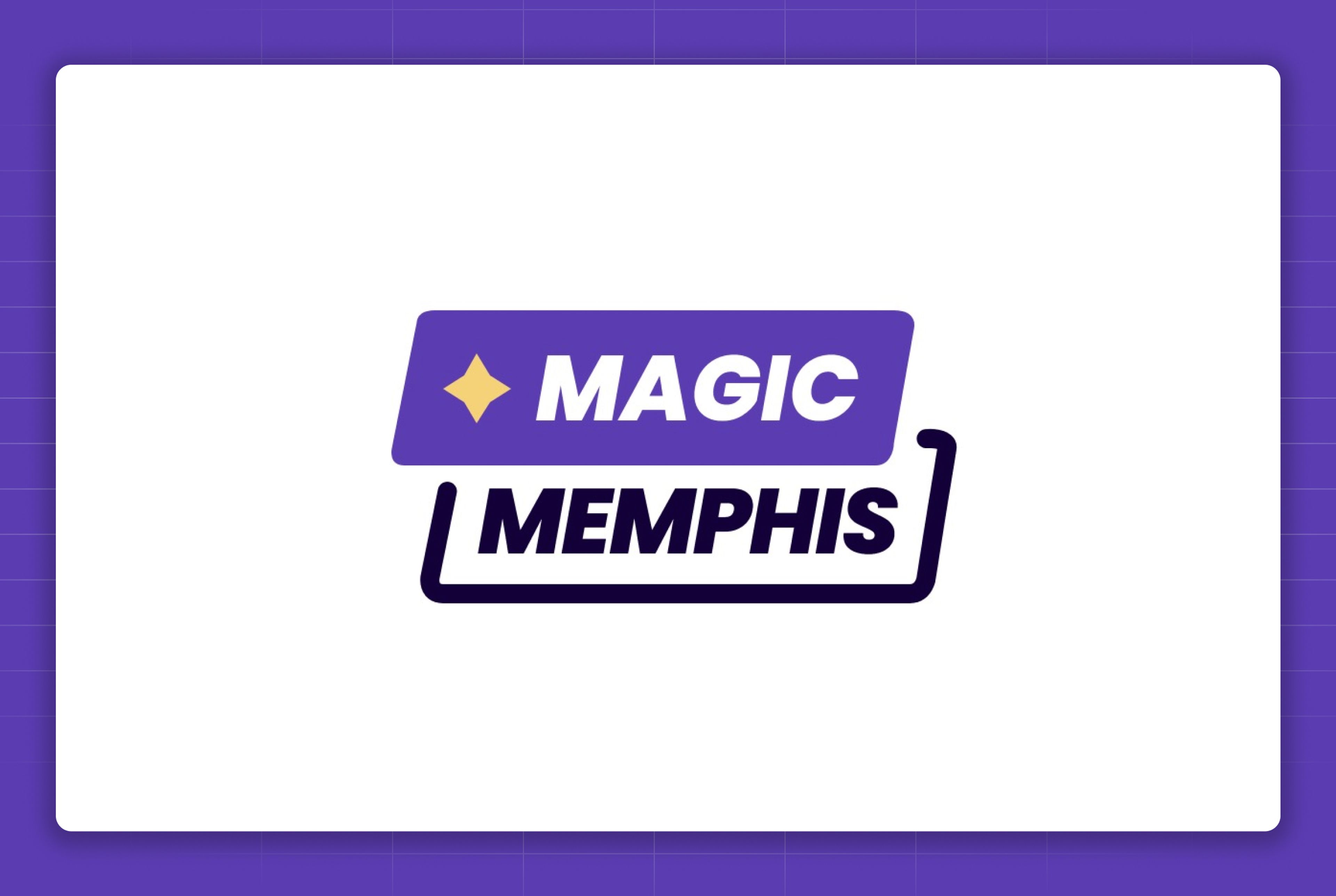
Meet Magic Memphis
Layerise's design language (Magic Memphis) is inspired by the Memphis group with a magical twist, creating delightful and playful experiences.
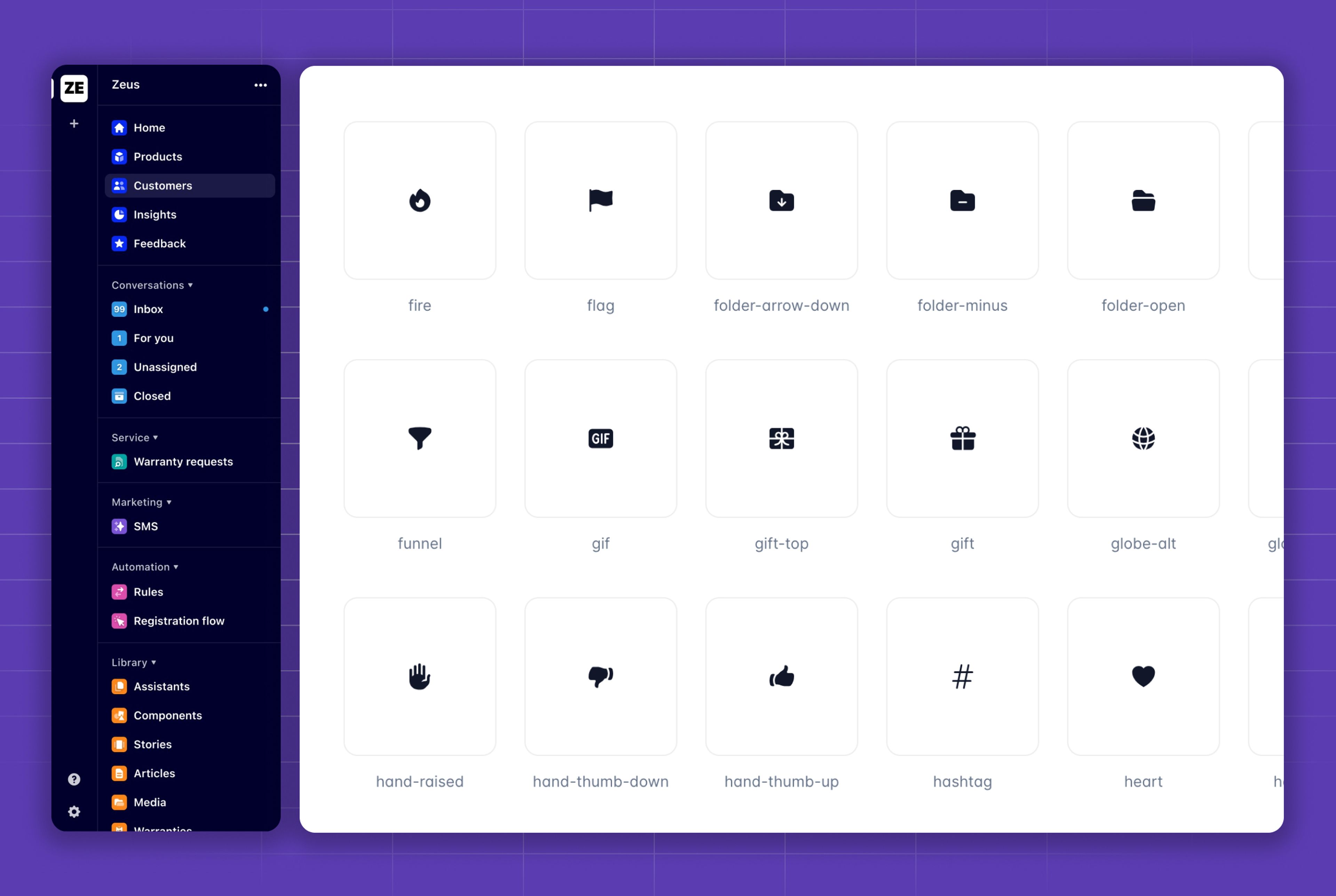
Icons & Iconographic
The icons filled with a playful angle with slight border radius to make it friendlier. In most cases when icons were used they were displayed together with an icon container in color as an additional UX improvement to group product areas together meanwhile increasing the playfulness of the product.
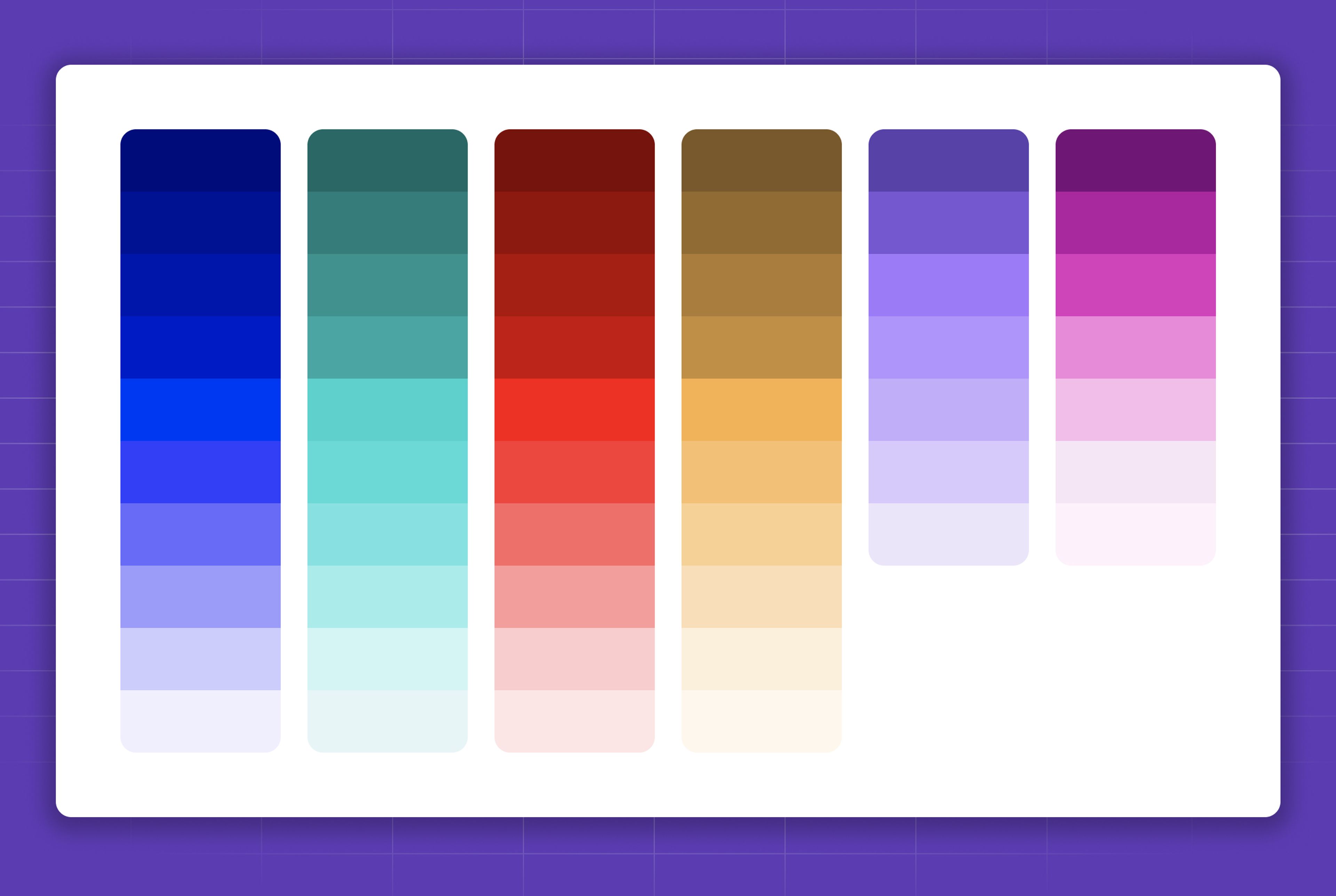
Color scheme
As part of a cohesive design language, we established a color scheme matching a playful experience by using vibrant colors.
The color scheme helped us for a number of reason like:
Consistency: It helps to ensure that all the components in a design system are consistent with each other. This creates a unified and polished user experience.
Clarity: Colors can be used to communicate different meanings and emotions to users. For example, red is often used to indicate errors, while green is often used to indicate success. By using a color scheme we could make sure all buttons, error notification etc were presented with clarity.
Accessibility: Color contrast is important for ensuring that all users, including those with vision impairments, can easily see and understand the content of a design system.
Efficiency: Creating a good and efficient process between designers and developers to save a lot of time and effort. The engineers never had to find the right hex code, as color variables were set in place and could be updated in one place.
Illustrations
Our Magic Memphis take on illustrations took inspiration from the geometric shapes from the Memphis group, together with grid patterns and playful colors. Huge shoutout to my teammate Karlīna Kluce who single-handed produced most of the Layerise illustrations.
Brand Merchandise
To make sure our employees felt a belonging and unified culture, we created brand merchandise both for special events like team camp and Christmas card. Furthermore, all new employees received a personal written welcome onboard card together with company merchandise to make sure they immediately were part of the brand.
Website
The Layerise website naturally followed suit of the branding and design system, but furthermore implemented our design principles. By utilising location, browser user settings, we built a website that was personal, interactive. When names, locations, time & date were shown it was based on the visitors' information. Furthermore, we used a service to capture the visitors' industry by ISP database, meaning if you worked at a bike company it will be shown on the website.
The design system
Right from the beginning of creating the first product prototypes, we invested heavily in design systems. We know this was a core part of providing consistent experiences and being able to keep a fast moment in product development. The design system was co-shared between the engineers and the design team, and its implementation was living in code. We used a library called Storybook to showcase behaviour and ruleset. Versioning was handled through NPM and was available in the visual editor (Framer) through its packing system. This allowed everyone to be on the same page all the time.
Design principles
To make sure we have a shared way of validating our experience and design, we created principles for the experience and for the design. This is to make sure we validated our experience with shared expectations and to unite the experience across all product offerings.
Experience principles
How should I feel using Layerise.
Design principles
How should the interface be perceived
Introduction to the research repo
A Research repository was established to bring together all the knowledge produced by the design team. The main points of having a research repository was to solve the following:
Accessibility: All stakeholders can easily access information whenever they wish.
Preservation: Repositories guarantee the long-term preservation of knowledge.
Visibility: The impact of the research work is increased.
Efficiency: Researchers can work more efficiently and effectively.
Collaboration: Teams can make better, data-driven decisions.
The research repository helped us to solve some of our biggest problems, such as access to knowledge by all stakeholders, cross-cutting insight sharing, centralization of information, and rescue and bringing to life useful information that was previously lost. The research repository resulted in more efficiently design research and effectively, and to deliver more value to the product.
Product UX/UI gallery
The gallery consist of imagery of products and features across 3 different areas, the website, the admin panel to which the customer's to build, learn and integrate and lastly the Assistant which was the white label solution the end-customer was engaging with.
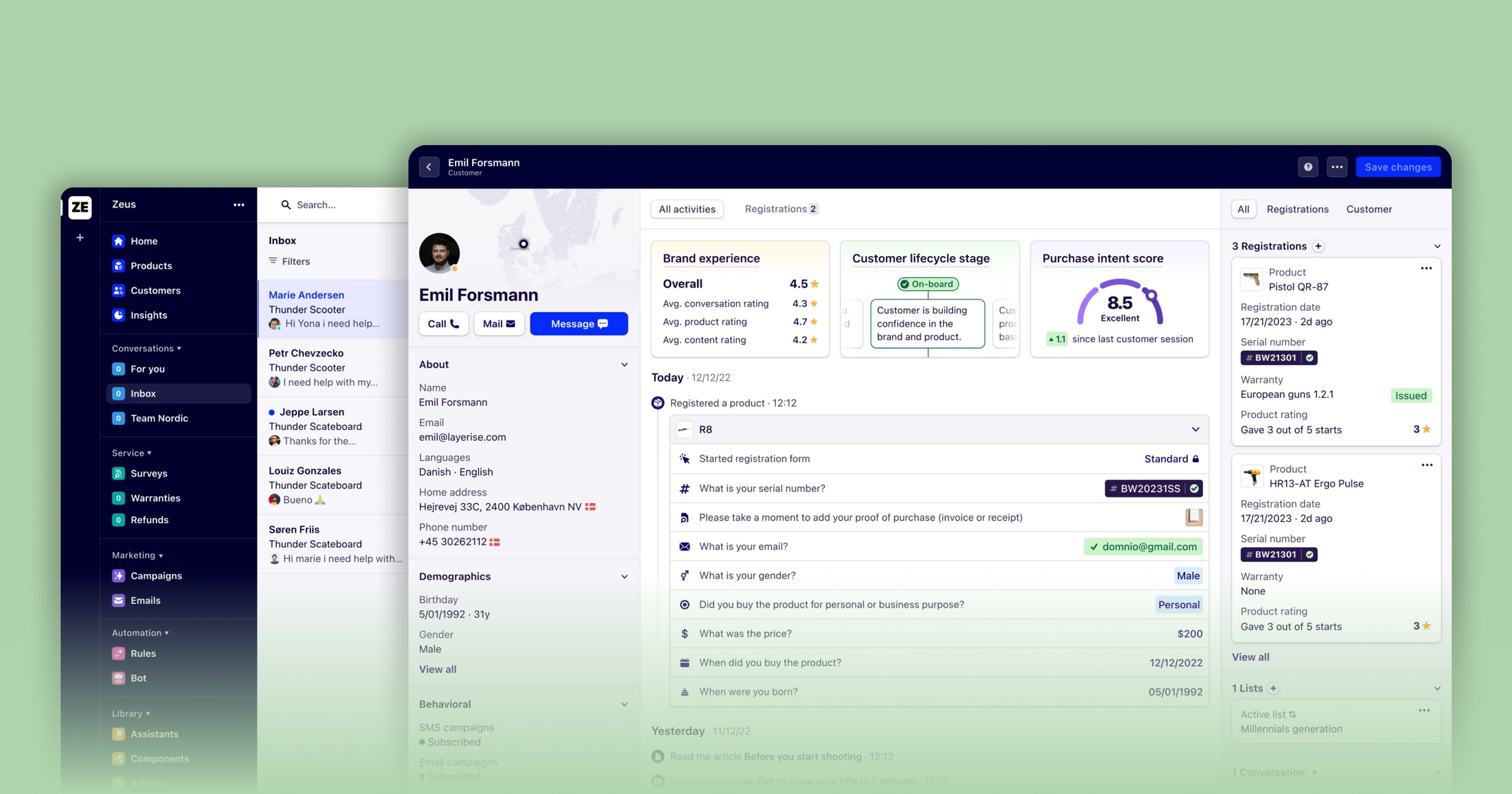
Admin
This was the main destination for Layerise customers, allowing them to build the Assistant, engage with their customers and gain valuable information about trends, customer profiling and product performance.
Assistant
The Layerise Assistant is the white label platform servicing manufacturer's own customers. The solution is a progressive web application making it installable on your device similar to an app while still giving the benefit of being accessible through the browser allowing for a fast experience and being crawlable by search engines.
The Assistant is supported in 32 different languages including RTL languages, the whole design system was optimised for such.